New Year’s Resolutions for Websites
Each year people around the world make New Year’s resolutions to lose weight, exercise, and to get organized. The same resolutions that can make you a better person can also be applied to your website. Here are some 2016 resolutions for your website.
Lose Weight

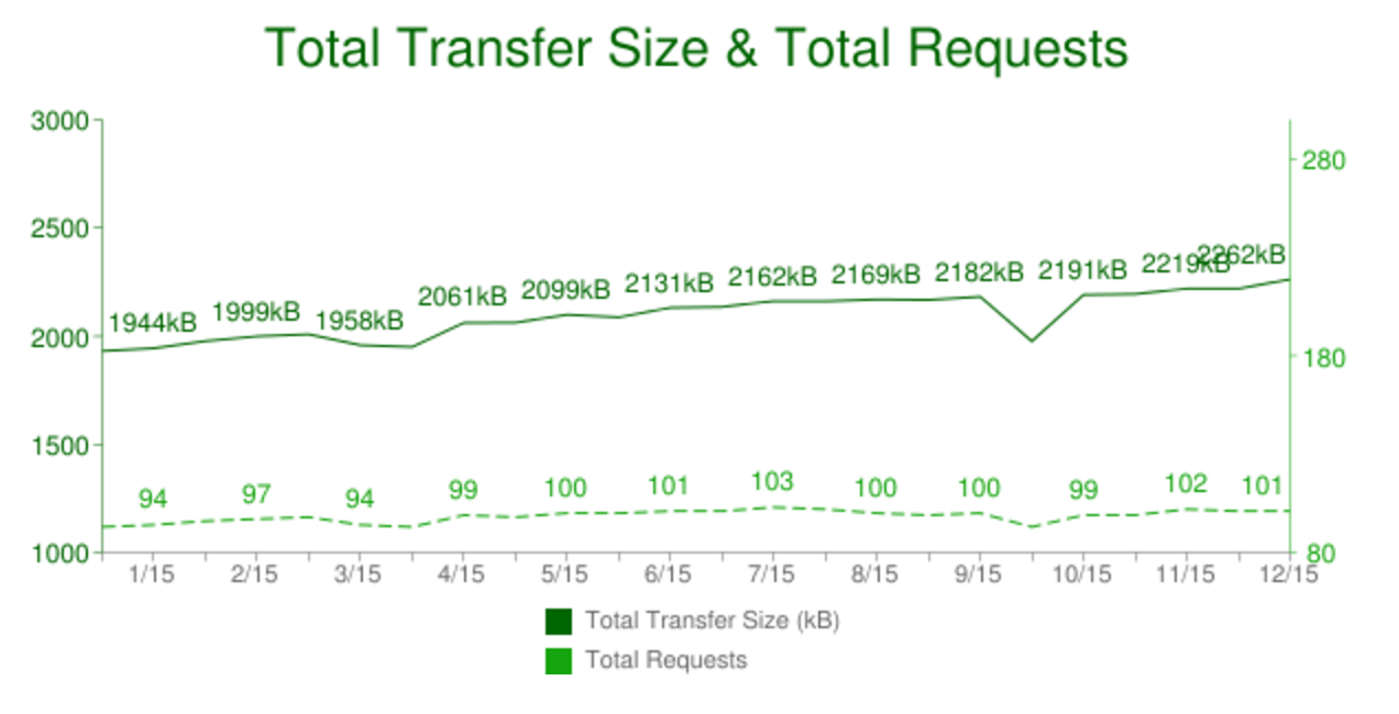
Websites continue to get bigger in 2015 (source: HTTP Archive)
There are two types of weight that websites put on:
- Page Size: The actual disk size of website pages continues to increase over time (see the above chart). Although the US and other countries have seen broadband speeds increase, the increasing reliance on smartphones (with cellular connections) and other mobile devices means that larger websites can have a real cost. The average webpage view will cost customers 16¢ in the US. You can measure the cost of your website in various countries online.
- Site Speed: Over time new features, tracking scripts, advertisements, and other additions can slow a website down even if the file size doesn’t increase. Webpagetest.org is one of the leading tools for measuring site speed and diagnosing a slow down. Site speed is directly correlated with usability and thus page views, engagement, and conversions. Research indicates that pages loaded in one second or less were noticed by, but not interruptive for, visitors. 10 seconds is about the limit of a visitor’s attention.
Get Organized
You may have heard some variation of this quote: “A place for everything and everything in its place.” This applies to websites as well.

Does your website’s filing system look like this? (Photo: USAID)
- Minimalism: One of 10 usability heuristics for interface design is minimalism. This is the idea that everything competes for user attention, so every bit of user interface diminishes the visibility of all other interfaces. In practical terms, this means that sidebar widgets, advertisements, and calls-to-actions are all competing with content for a visitor’s attention.
- Navigation: With new projects, our UX Designers consider content, relationships, and business goals to structure and provide navigation. Over time this structure can become obfuscated or ineffective as a site’s architecture and content is expanded and site priorities subtly shift.
Help your site’s organization by removing ineffective or unnecessary content and user interface. We can record interactions by implementing specific analytics for events and conversion goals. Proper analytics will tell us precisely what is or isn’t being used. We can then follow-up with user tests, surveys, or interviews to understand why.
Be a Better Person
One of the more abstract resolutions people set for themselves is to “be a better person.” We can apply the same resolution to websites and, better yet, we can measure progress. There are many ways to make your website treat humans better; we recommend focusing on website usability with specific attention placed on microcopy and accessibility.
- Usability: A website that is usable is more efficient, easier to learn, and more satisfying to interact with. We can test for usability by recruiting participants and recording their attempt to accomplish a series of tasks. We recommend writing tests for a specific user flow and recruiting both smartphone and desktop participants. If you haven’t read it yet, Steve Krug’s Don’t Make Me Think is recommend reading on web usability.
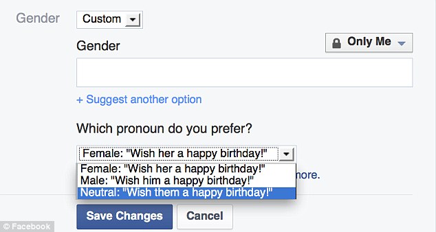
- Inclusiveness: We generally want everyone to feel comfortable using our site, but when moving fast, testing the response of people from different communities and backgrounds is often overlooked. We’ve written about the impact of microcopy — the small bits of text that help support and describe user interfaces. This includes navigation, labels, help text, and forms.

In February, Facebook introduced the ability for it’s users to identify as any gender.
- Accessibility: Your website should be usable for everyone regardless of permanent or temporary, physical or cognitive disabilities. Most WordPress-powered websites have an accessibility head-start and 10up front-end engineers code with accessibility best practices in mind:
At minimum, every 10up project should make use of ARIA Landmark roles, semantic headings, and alt text on images.
10up conducts additional accessibility audits to ensure websites provide the best possible experience for users of assistive technology or to ensure compliance with Section 508, or other international accessibility laws and guidelines (e.g. WCAG 2.0 or ADA). Senior Front End Engineer Corey Ellis spoke about accessible, responsive, and responsible web design at LoopConf in May.
Accessibility, usability, information architecture, and front-end engineering best practices were central themes during 10up’s annual all-hands summit in 2015. User experience will continue to be a key part of our ethos. We invite you to join us in 2016 by setting a New Year’s resolution to make your website faster, better organized, and more human-friendly.
 Taylor Dewey