Testing the Gutenberg Publishing Userflow
The WordPress Design Team recently had an in-depth conversation in Github about enhancing the publisher flow in Gutenberg. After watching Gutenberg go through several iterations since our last user test, I decided to try testing the current flow to see how well it was received by publishers. I hoped to identify friction or pain points in the Gutenberg authoring experience in the interests of helping refine the publishing flow.
The primary question asked in the user test was: Is the Gutenberg publishing flow intuitive and easy for digital content publishers to use? Secondarily, I wanted to identify more specific friction points in the publishing experience.
Methodology
To qualify, participants needed to be publishing at least 6 pieces of content per week using a web CMS. Five qualified participants were asked to complete several tasks using Gutenberg.
Each unmoderated session was recorded to observe behavior and task completion as participants moved through the desktop experience. Participants were also given a series of questions to answer during and after the test. As we often do at 10up, we used a service called Userfeel to conduct these tests and capture the data. These tests were conducted against Gutenberg version 3.9.1.
The results
The data surfaced several specific points of interest:
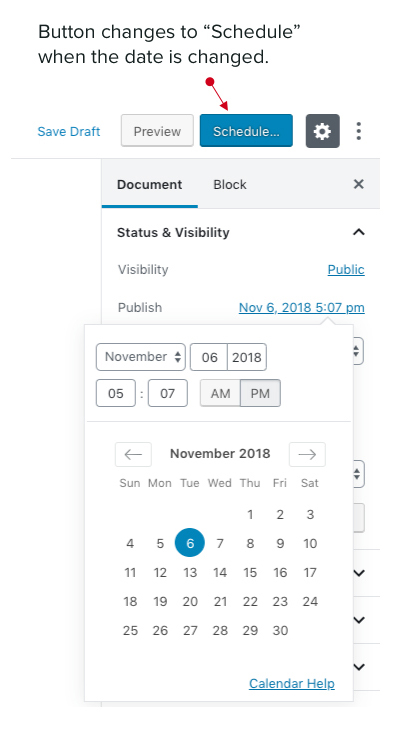
- 3 out of 5 participants unknowingly failed to schedule later publication because they didn’t click the “Schedule” button after changing the date and time.
- Previewing the post, adding tags, and changing the author were successfully completed by 100% of participants. The one caveat is that one participant made several of these updates in the list of posts outside of the post editor screen.
- While this user test focused primarily on the final steps in a typical publishing flow, there was a task to change an image. People struggled to complete this task, taking a long time to accomplish it or failing to complete it at all.
- Overall, there were few friction points in the experience. While participants did struggle to complete a few tasks, they were not overly frustrated or completely lost.
Overall System Usability Score
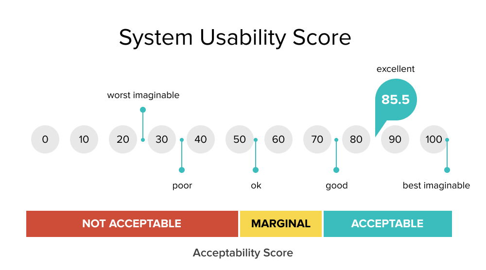
The System Usability Scale (SUS) is a tool used to measure the usability of an experience using 10 questions with which respondents agree or disagree on a scale from Strongly agree to Strongly disagree.

The experience scored an 85.5, which is well within the “Acceptable” range, and can even be considered “Excellent.” However, this does not mean there are no opportunities to further reduce friction.
Specific Pain Points
Two of the tasks revealed opportunities for refining the Gutenberg interface.

The first was changing an image. This task took all participants more than one minute to complete, and one failed to complete it after four and a half minutes of trying. The four that did complete the task often used workarounds, rather than the intended interaction: clicking the edit icon in the block. One participant changed the block to a gallery, inserted the image they wanted, and then deleted the other image. Another participant used the “featured image” feature to add a new image and then dragged it into the body copy area, where they then deleted the existing image they did not want on the post. The takeaway is that the edit icon is not immediately noticeable by users and should be refined.
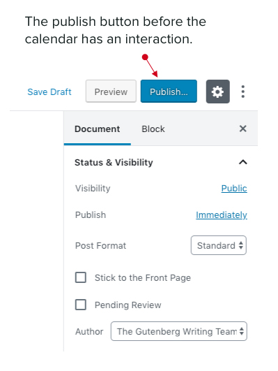
Participants also struggled to schedule publication at a later date. Three of the five participants failed, despite thinking they succeeded. The failures were all the same: a participant saw the UI for the calendar, and changed the date and time, but never clicked the “Schedule” button. Each moved onto the next task and said that the scheduling process was easy.
Pain Points and Friction
Task Two – Changing an Image
“Let’s pretend you don’t like an image being used in this article. Update it with a new image.”
This task took the longest amount of time to complete. Other tasks in the test took less than one minute to finish.
- P1: Not completed. Took 04:32
- P2: Completed. Took 01:15
- P3: Completed. Took 02:41
- P4: Completed. Took 01:49
- P5: Completed. Took 04:19
Task Five – Scheduling a Post
“Schedule this article to automatically publish tomorrow.”
3 out of 5 participants failed this task. All three of the fails thought they were successful with the task.
- P1: Failed
- P2: Success
- P3: Failed
- P4: Failed
- P5: Success (although they didn’t receive the success message because their computer was loading/spinning)
Next steps
I’ve presented the findings to the WordPress Design Team, and am planning a follow-up test focused on the “publish” button, based off of the finding around scheduling a post.
10up ❤️ Open Source
Helping to improve WordPress, through unmoderated user testing, design support, or engineering time is just one of the many ways 10up contributes to the WordPress community. Our user-centered approach to design can help you identify and fix pain points in your digital products.


Comments
Thank you for undertaking this testing, but Gutenberg is not blogger-friendly in my experience, however hard I try to learn it. It would be interesting to know how participants in your testing would go on editing a typical blog post of around 1000 words, with many images inserted; how they would find copying, cutting and pasting between paragraphs, above and below image ‘blocks’, inserting images into existing blocks, changing captions, changing image justification and size, editing and correcting text on the fly. I’m finding it takes 10x as long as the old editor with the added disadvantage that, unlike switching between visual and code editing in the old version, switching back and forth between the ‘classic’ editor reveals they are totally incompatible, a completely garbled, unpublishable post resulting.
WordPress 5.0.2 which includes Gutenberg version 4.7.0, should fix a number of performance issues related to the default block editor.
Sir I am getting an error after updating wordpress 5.2 on my home page https://www.androidterritory.com/ .